CASE STUDY
BRANDING THE CITY OF VISTA, CALIFORNIA
From a social post that got to the right person, to the branding of an entire city.
In January of 2024, I had just gone out on my own with Vibrosonic as a full time studio. I had been using the Vibrosonic name for freelance work for years, but now it was real. I had noticed a post by another well respected designer about a job he had completed rebranding a city in the Midwest and I started looking around my home town of Vista, California. I had always noticed that the city’s logo looked like it has been designed by a third grader…no disrespect to third graders! But it was time for a rebrand. So I sat down one afternoon and created an entire branding scheme for my city. And I posted it on social media. And it caught the eye of the right person.
I got a note from a local who said I should send my designs in the a certain person in the city offices. The next thing you know I was in the running with a handful of other designers for the job of rebranding of Vista. From what I’ve been told, my presentation blew everyone away and the job was mine. Committees were formed, meetings were had, directions were determined and the design process began. I work fast, and it wasn’t long before I had a new presentation put together with some options for the committee to peruse. Favorites were chosen and, long story short, after many meetings and emails, we zeroed in on the final design.
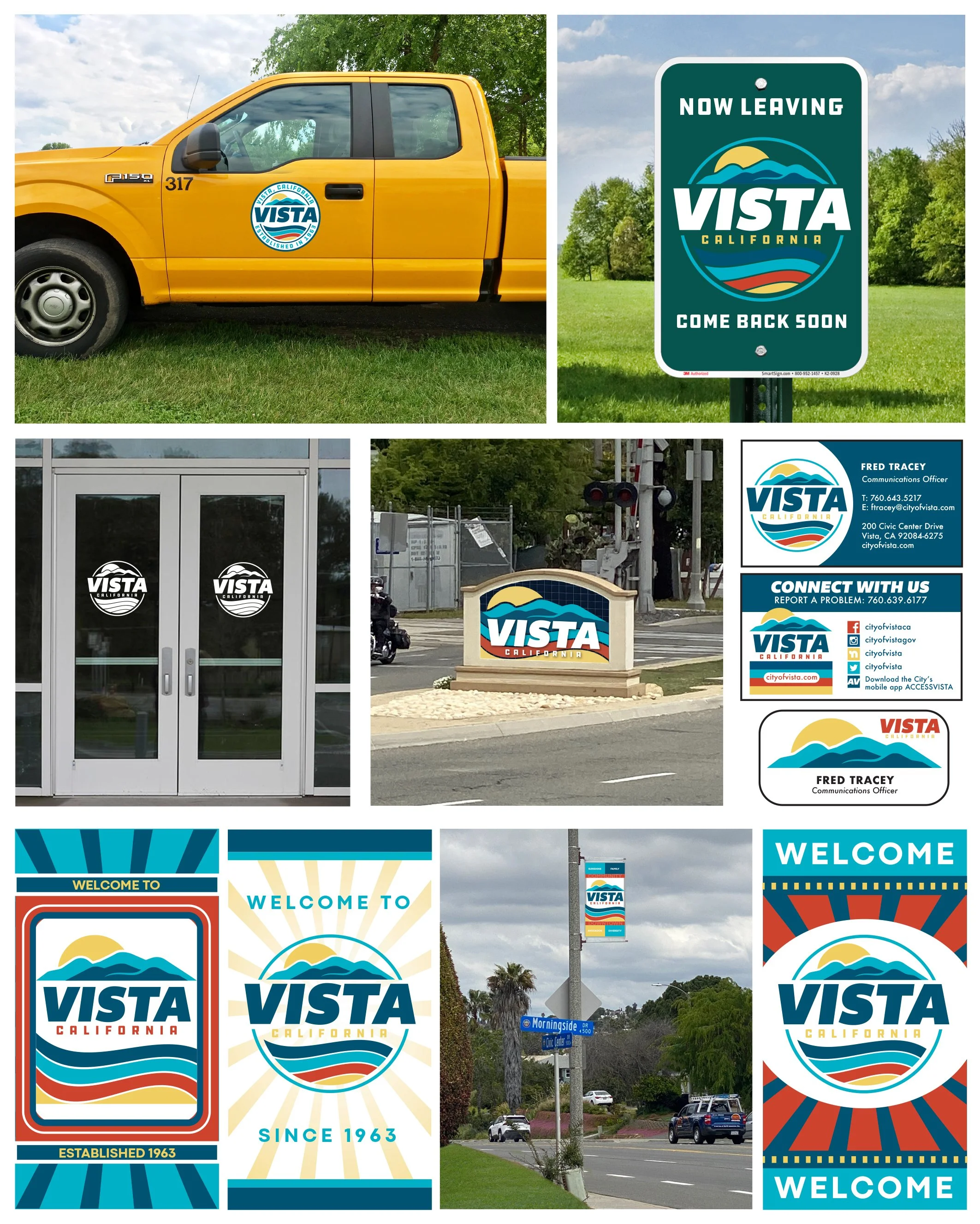
Here are some images to give you an idea of where it started, where it went, and where it ended up. There are many departments within a city, and levels and layers below that. I won’t bore you with each and every design that it takes to fill the needs of every tiny detail, but just know there are countless variations on many of the designs.
This was a project that I absolutely loved working on and would love to take on designing other cities in the future. Let me know if your city is stuck in time and could use a good update!
Please note: the new Vista branding has not been implemented at this time and there is a story behind it that I can’t post here on the website. But I’d be happy to share with you privately if you’d like to know.

This is the original post I made on Instagram in January of 2024. Although this is not the logo that was ultimately chosen, it’s what got the ball rolling.
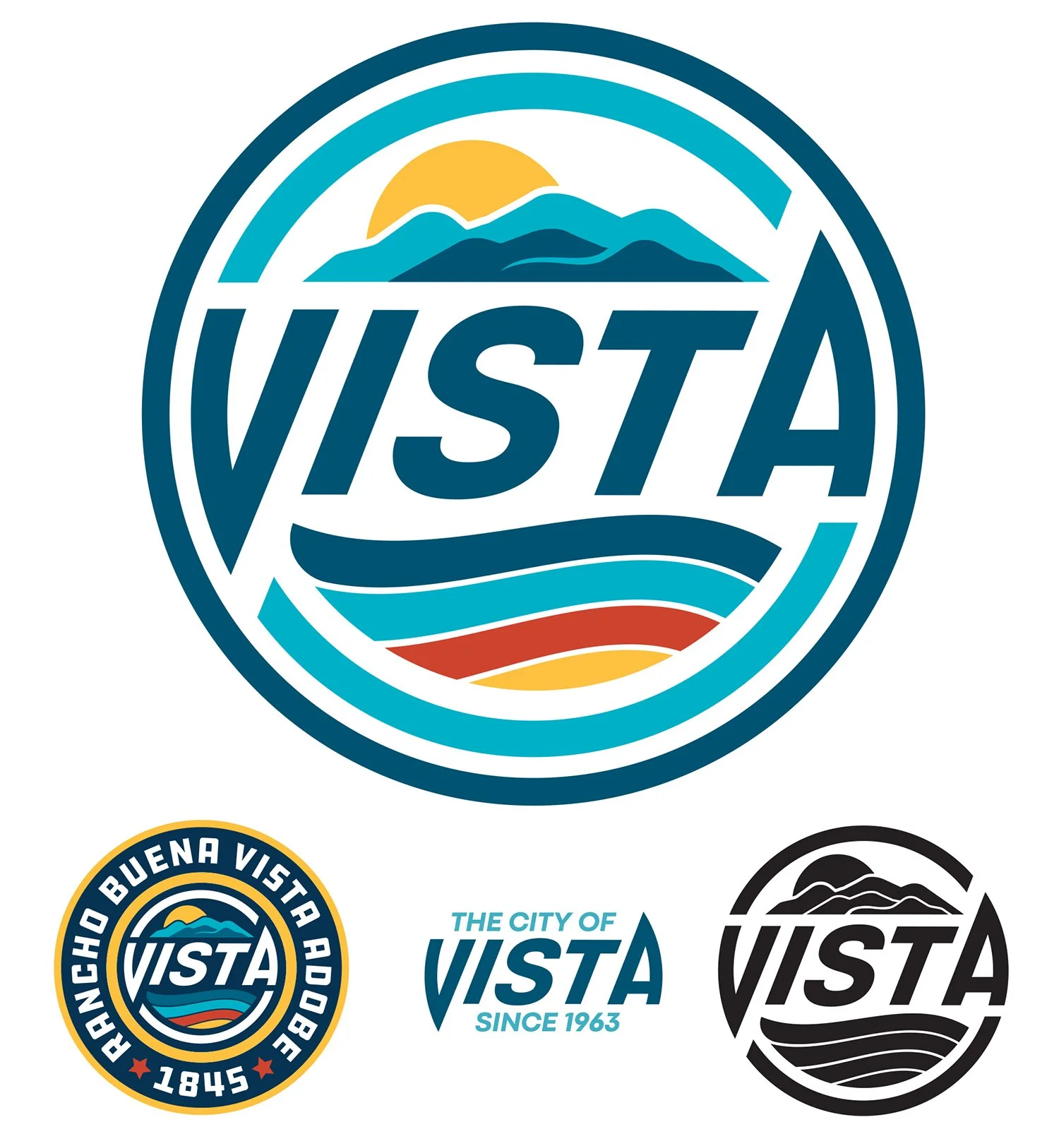
The following are (almost) every logo design presented in Round One, of which none were actually chosen, but parts and pieces were stolen, and a direction was established. Colors were also narrowed down. There were also mockups of street signs, trucks, light pole banners, and more presented at this time. It was helpful for others to see designs in their natural habitat. Also note that many of the designs feature four of something. Four feathers on a wing, four V shapes, four striations in the hills. This is because the city of Vista is sectioned into four districts. Also, Vista sits about halfway between the Pacific Ocean and the inland mountains. Some designs reflect that geography.

The bottom few logos shown above were chosen as the design to present to the Mayor and City Council at a Vista City Council Meeting. However, due to unforeseen circumstances, the project was put on hold for over a year. Finally, in October of 2025, the designs were presented to the Mayor and City Council and were sent for individual review meetings with each council member.
• • • • • •
Following that process, with really great new input and suggestions from those meetings, we have arrived at what I think is an excellent design (shown below) that will now go before the City Council in January of 2026 for final approval. Basically a combination of the very original design I did for social media, combined with the design that was at one point chosen as the design of choice. The two together create a great visual that will hopefully represent our city for years to come.
When rebranding a city, no matter the size, there are a million little things to update or redesign with new colors and styles. Here are only a few: city work trucks, road signs, buildings, monument signs when you enter the city, city employee business cards and security badges, and street banners. You’ve also got websites, paperwork and documents, uniforms, clothing, hats, and so much more!